Choosing Decor Colors You Won't Regret
August 2nd 2024

When you’re wondering how to choose paint colors for your home, making an actual decision can be paralyzing. There are hundreds of hues to wade through, and if you choose the wrong paint color, it could ruin your home’s ambiance and be expensive and/or time-consuming to fix. That’s a whole lot of pressure!
All that said, choose you must. (Apologies for the Yoda speak.) And don’t worry, selecting the right colors is definitely a task you can handle. One way is with the help of an interior designer or color professional, but you can also pick yourself with a bit of guidance. Here’s some advice from the pros on how to choose paint colors for your home that you won’t regret (and have to paint over).
How to choose paint colors that set a mood

Here’s one rule of thumb when it comes to paint colors: Light colors make spaces feel bigger and brighter. Dark or intense colors (like fire-engine red) make spaces seem smaller—however, these colors do have their place and purpose in a home.
“Dark or intense colors are great for adding drama,” says Amy Bly of Great Impressions Home Staging/Interiors.
Another consideration with your paint color is whether it exudes “warm” or “cool” undertones. Basically “warm” undertones are in the brown/tan/beige range, “cool” ones in the gray/green/blue range.
“There are benefits to both tones, but in general, warm colors exude a cozy vibe, and cool ones offer a clean, tranquil feel,” says Liz Toombs, president of PDR Interiors.
How to choose paint colors that match the space
Not sure whether to go warm or cool on your paint colors? Certain types of rooms tend to look better one way or the other.
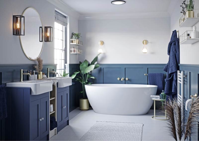
“Bathrooms tend to look better with cool colors, both because of the connotation of water as cool and the color in nature is blue or blue-green,” says Bly.
Never paint a bathroom yellow, says Toombs. “It makes you look sickly, and it’s difficult to apply makeup,” she explains.
Kitchens can be painted cool or warm, depending on the cabinets, flooring, and tile. “Cherry cabinets have red tones, some floor stains are orange-y, and pine has yellow undertones,” Bly adds.
Kids’ rooms can be brighter or richer, so pick hues you or your kids love.
Let a neutral paint color anchor your home

You know how the staples in your closet are often in “neutral” shades such as white, gray, and beige because these colors go with everything? Your home is no different, and needs a dominant “neutral” shade, too.
“It often looks best to have a main neutral as your base to carry throughout the home,” says Dessie Slickers of Slick Designs. Keep your base color in the common areas, and add coordinating colors and accents as desired.
The main or dominant neutral color should cover 60% of your home, leaving 30% for secondary colors (trim, ceiling), and 10% as the accent shade, explains Sara McLean, a color specialist at Dunn-Edwards Paints.
Most color schemes settle into a range of three to six colors, say experts. But the dominant neutral is your anchor, tying your home together.
Consider your furniture, carpet, and floor

There are a million paint choices, but you have only one Oriental rug and a single settee. So if you’re stumped on what colors to choose, check your furnishings as a starting point.
“By looking to your textiles and furniture, you can build a foundation for the room, which allows the paint choices to become more obvious,” points out Toombs.
How to choose secondary and ‘accent’ colors

Once you’ve pinpointed your main neutral paint color and its overtones, you can choose secondary colors, ideally in the same temperature range: warm goes with warm, cool with cool. Cool colors include blues, greens, and purples, while warm ones are shades of red, orange, and yellow, explains Karen Gray-Plaisted of Design Solutions KGP.
Got that ironed out? Then consider adding a third, more daring “accent” color. It can be a contrasting color, or a darker or lighter shade of the main or secondary color, explains Toombs.
The thing you want to avoid is colors that clash. This occurs when pairing colors of different saturations, like a pastel and an energetic bright.
“Clashing also happens when two colors are together from the same family but with different undertones: think bright red with rusty red,” says Toombs.
Paint a small swath to test how the color looks
Let’s face it, the art of how to choose paint colors is just that–art, not perfect science. So test things out! Don’t go buying gallons of paint and putting it up based on one tiny paint chip! Instead, order a small can so you can paint a 3-foot-square swath on your wall, or paint butcher paper and tape it to your wall instead.
The point is to get a decent amount of wall space covered so you can actually see how it’ll look, and observe it over time, in different lights. Making sure you’re sure before you paint the entire place will leave you with colors you love (and won’t be itching to repaint).

|